
I am a big aviation fanatic, and I always draw a lot of inspiration from things related to aviation technology, standards, and logistics.
In my day-to-day work, I am mostly searching for things that can make the product I build better day by day, or make my hobbies better.
In between these two, I got to know about an eccentric-looking font on Google Fonts that I seem to have already overlooked while watching videos or playing aviation games on the simulator; yes, a déjà vu sort of scenario.
 Credits: FlyByWires Simulation Documentation
The font was none other than B612 Mono, and I was just a search query away from finding out that it was designed by Airbus and open-sourced in collaboration with a few other companies. I am using the monospaced version here, which is the one that makes sense for code. Also, the names of the creators sounded more French, so it was obvious that it wasn’t Boeing or Lockheed Martin. You can read more about it on their collaboration partner’s page called ENAC.
The Google Fonts page describes it as “a highly legible open source font family, designed and tested to be used on aircraft cockpit screens”, and it is not surprising that if this was made considering aviation standards, then it is a must-try for me.
Fonts designed for aviation are not only about looking clean. They exist because a pilot needs to read numbers, letters, and symbols quickly without confusing one character for another, sometimes in a very busy cockpit. That is not too far from programming, where a missed character can change the meaning of the whole line.
Legibility is common between pilots and software developers. OSHA suggests a monitor viewing distance of 20 to 40 inches, while FAA human factors guidance cites 29 inches as the nominal cockpit display viewing distance from the pilot’s design eye point. Both are often reading important information from roughly an arm’s length away, whether it is a cockpit screen or a monitor full of code. Some developers are more picky about their font, irrespective of how the code works, and unfortunately, I am one among the group. What do you think I did when I noticed this new mystery font? Yes, I downloaded it and set it as my editor’s default font.
I just wrote a simple Haskell program for the Fibonacci series using an à la carte font called Menlo, another great font for coding.
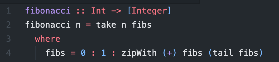
And then I switched to B612 Mono to check the difference.
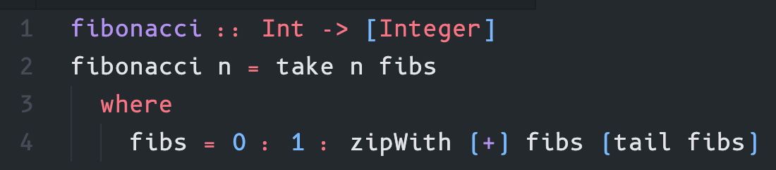
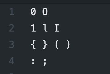
Code is not read as prose. Most of the time, the eye is moving between small tokens: 0, O, 1, l, I, brackets, colons, semicolons, arrows, and commas. A coding font earns its place when these marks do not ask for a second look.
See how the tokens look in Menlo
and in B612 Mono
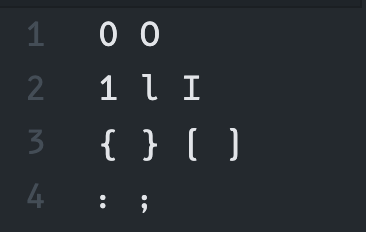
This is where the cockpit origin starts making sense. A pilot should not confuse one character for another on a display, and a developer has a smaller version of the same problem while reading code. The cost is different, of course, but the eye is doing a similar job: separate nearby shapes quickly and move on.
My first impression was that the font felt more practical than beautiful. Menlo still feels more familiar to my eyes, but this one made some characters look more deliberate, almost as if the font was asking me to slow down and read the code properly. I am not sure if I would use it forever, but I liked seeing a cockpit-focused font behave surprisingly well inside an editor.
The main motive of any font designed for aviation is how legible it is for the eyes of the pilot. Any wrong stat or metric can have disastrous effects. On the other hand, the legibility of a coding font is synonymously associated with the working hours a developer could work and how enjoyable it is to read the code. The only difference is that, on one hand, legibility issues can cause the plane to crash, and on the other hand, nothing hysterical happens (unless the code is missing semicolons).
I am not sure if I will keep it as my default font, but I like the idea that something made for cockpit screens can find a second life inside a code editor.